The Ultimate Color Coordination Guide: Master Your Wardrobe in 2026
Discover the science behind perfect color combinations and learn how to create stunning outfits that complement your skin tone, body type, and personal style with our comprehensive guide.
OutfitScore Styling Team
AI & Fashion Experts
Published: January 15, 2025 · Updated: March 2026
Reading time: 8 minutes
Quick Answer
Color coordination means combining hues using proven rules: complementary (opposites on the color wheel), analogous (adjacent colors), or neutral anchoring. For outfits, match your dominant color to your skin undertone, limit combinations to 3 colors, and use the 60-30-10 rule — 60% base, 30% secondary, 10% accent.
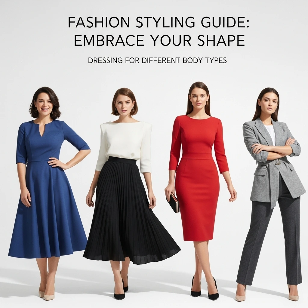
Perfect color coordination can transform any outfit from ordinary to extraordinary
Color coordination is the secret weapon of every stylish person. Whether you're getting dressed for work, a special event, or just running errands, understanding how colors work together can make the difference between looking put-together and looking like you got dressed in the dark.
In this comprehensive guide, we'll explore the science of color theory, help you identify your perfect color palette, and provide you with practical formulas for creating stunning outfits every single day.
Quick Answer: How to Coordinate Outfit Colors
To perfectly coordinate colors in any outfit, follow these core rules:
- Identify your skin undertone: Cool undertones look best in blues and silvers, while warm undertones suit earth tones and gold.
- Apply the 60-30-10 rule: Use 60% of a dominant neutral color, 30% of a secondary complementary color, and 10% as a bold accent pop.
- Use the color wheel: Pair analogous colors (next to each other) for harmony, or complementary colors (opposite each other) for high-contrast impact.
- Start with neutral foundations: Black, white, navy, and beige match almost everything and act as anchors for brighter accessories.
Step 1: Understanding Your Skin Undertone
Before diving into color combinations, you need to understand your skin's undertone. This is the subtle hue beneath your skin's surface that affects how colors look on you.
Cool Undertones
You likely have cool undertones if:
- • Veins appear blue or purple
- • Silver jewelry flatters you
- • You tan rarely, burn easily
- • Pink or rosy cheeks
Warm Undertones
You likely have warm undertones if:
- • Veins appear green
- • Gold jewelry flatters you
- • You tan easily
- • Yellow or peach undertones
Neutral Undertones
You likely have neutral undertones if:
- • Veins appear blue-green
- • Both gold and silver work
- • Mix of cool and warm features
- • Can wear most colors well
Step 2: Color Theory Made Simple
Understanding basic color theory will help you create harmonious outfits that look intentional and sophisticated.
The 60-30-10 Rule
This is the golden rule of color coordination used by professional stylists:
60% - Dominant Color
Usually neutral (pants, dress)
30% - Secondary Color
Complementary shade (top, blazer)
10% - Accent Color
Pop of color (accessories)
Color Combination Techniques
Monochromatic
Different shades of the same color. Creates a sophisticated, elongating effect.
Example: Navy blazer + light blue shirt + dark blue jeans
Analogous
Colors next to each other on the color wheel. Creates harmony and flow.
Example: Blue top + blue-green accessories + green pants
Complementary
Opposite colors on the color wheel. Creates striking, bold combinations.
Example: Orange top + navy blue jacket
Step 3: Foolproof Color Combinations
These tried-and-true color combinations work for any occasion and can be adapted to your personal style.
Best Colors for Cool Undertones
Power Combinations:
- • Navy + Crisp White + Silver accessories
- • Charcoal Gray + Jewel Tones (emerald, sapphire)
- • Black + Cool Pink + Pearl accessories
- • Cool Gray + Lavender + White
Colors to Embrace:
True blue, emerald green, magenta, cool grays, pure white, black
Best Colors for Warm Undertones
Power Combinations:
- • Camel + Cream + Gold accessories
- • Warm Brown + Rust Orange + Ivory
- • Olive Green + Warm Beige + Bronze
- • Terracotta + Warm White + Copper
Colors to Embrace:
Warm browns, olive green, coral, peach, cream, gold, rust
Common Color Coordination Mistakes to Avoid
❌ What NOT to Do:
- Wearing too many colors at once - Stick to 3-4 colors maximum
- Ignoring your undertone - Wrong undertones can wash you out
- Matching everything exactly - Perfect matches can look costume-like
- Forgetting about proportions - Balance bright colors with neutrals
- Avoiding color entirely - Don't be afraid to experiment!
✅ What TO Do Instead:
- Start small - Add color through accessories first
- Use the mirror test - Does the color make your eyes pop?
- Consider the occasion - Bright colors for casual, muted for professional
- Play with textures - Same colors in different textures add depth
- Trust your instincts - If you feel confident, you look confident
Seasonal Color Coordination
Adapt your color choices to the seasons for a naturally harmonious look that feels fresh and current.
Spring
Soft pastels, fresh greens, coral pink, lavender
Summer
Bright whites, ocean blues, sunny yellows, tropical prints
Fall
Rich burgundy, burnt orange, deep browns, olive green
Winter
Deep jewel tones, classic black, pure white, silver accents
Put It All Together: Sample Outfits
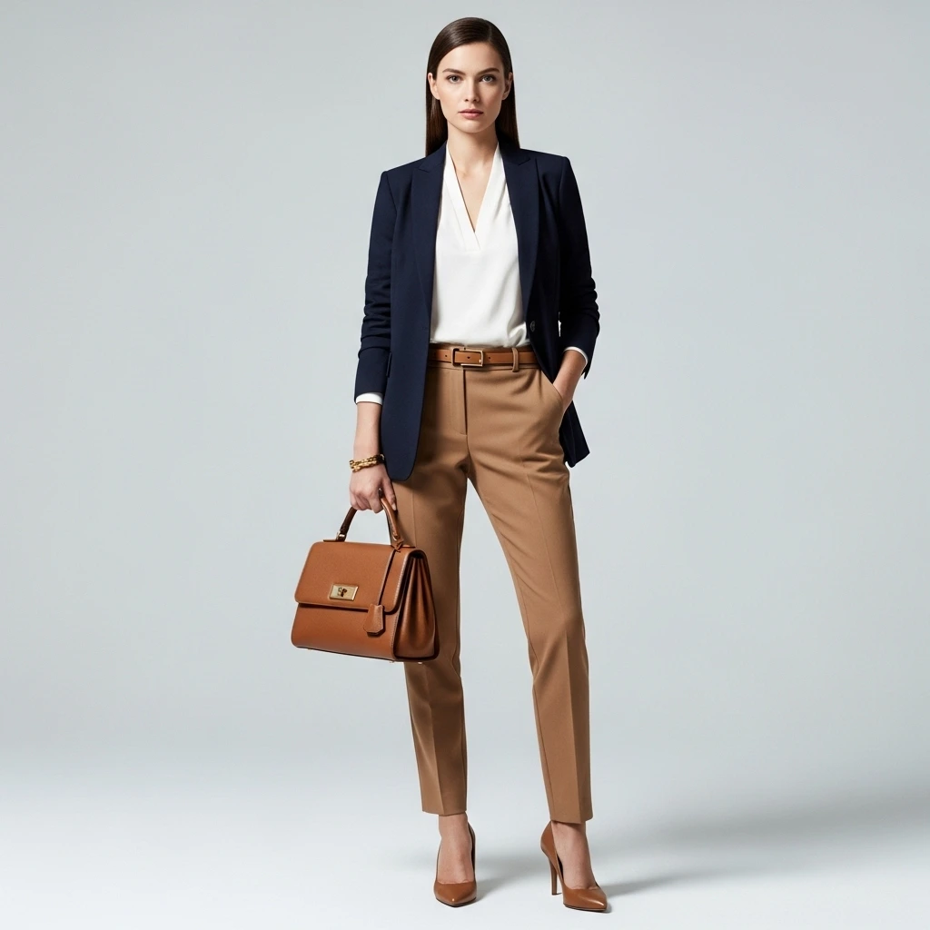
Professional Work Outfit
Base (60%)
Navy blazer and matching trousers
Secondary (30%)
Crisp white button-down shirt
Accent (10%)
Burgundy leather belt and shoes
Casual Weekend Look
Base (60%)
Light wash denim jeans
Secondary (30%)
Soft pink sweater
Accent (10%)
Gold jewelry and brown leather bag
Ready to Master Your Color Coordination?
Use OutfitScore's AI analysis to get personalized color recommendations for your unique style.
Try Free Analysis